 Alert Enterprise · v0.2.0
Brand
Guidelines
How Alert Enterprise looks and sounds: logo, colors, type, images and words, with live examples and downloads.
Identity
Our logo is a coral shield beside the Alert Enterprise name. Place it on white, black or purple.
Direction
Alert Enterprise is a security company that looks like modern software: frosted glass over soft color, large clear type, clean product screens. Locks, shields and badges are welcome. Old-fashioned styling is not.
Show security subjects with a modern software look. rule: modern-software
One language across our whole portfolio. Mobile credentials, visitor management, identity governance and physical access share the same colors, type, shapes, glass, motion and icons. Products differ by name and by the icons they use, never by their own palette or styling. rule: one-language
Logo
Three backgrounds our logo can sit on.


Place our logo on white, black or brand purple (#5F51D5) only. rule: logo-grounds
Try a background
Pick a color to see if our logo can go on it.
Shield
Four parts. Only the left fold has a gradient.
- Fold. Coral fading into red.
- Face. Solid coral, #FF5233.
- Base. Solid coral, curving into the fold.
- Cut. Always white.
Clear space and smallest size
Leave empty space around our logo as wide as its shield. Drag to find the smallest allowed size.
Keep clear space equal to shield width on all four sides. Minimum logo width: 120 pixels on screen, 30mm in print. Shield alone: 16 pixels. rules: logo-clearspace, logo-minimum
What not to do
Alert EnterpriseSmall spaces: browser tabs, app icons, avatars
The shield stands in for the full logo when there is no room for the name. Shown at the size each one is actually used.


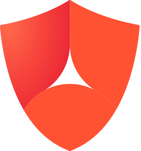
Use the shield alone, never a shrunken full logo and never letters. On dark app surfaces use the white shield on purple; everywhere else use the coral shield. rule: small-space-mark
<link rel="icon" type="image/svg+xml" href="/ae-shield-coral.svg"> · <link rel="apple-touch-icon" href="/ae-shield-180.png"> · web app manifest: 192 and 512, plus the purple version as maskable.
Which file to use
These files stay sharp at any size.
| Version | Use on | File | ||
|---|---|---|---|---|
| Coral shield, ink name | White. Default choice. | ae-logo-full-coral-ink.svg | Download |
| Coral shield, white name | Black and brand purple. | ae-logo-full-coral-white.svg | Download |
 | One color, ink | One-color print, fax, embossing, etching. | ae-logo-full-allblack.svg | Download |
 | One color, white | One-color white, on purple or on a darkened photo. | ae-logo-full-allwhite.svg | Download |
| Shield, coral | App icons, website tab icons, profile pictures, slide corners. Show our full logo first. | ae-shield-coral.svg | Download |
 | Shield, one color | Ink or white outline, for one-color work. | ae-shield-allblack.svg | Download |
Naming
How to write our company and product names.
Company name
Always Alert Enterprise: two words, both capitalized. AE is fine internally and where space is tight, but not in customer writing on first mention.
| Write | Not |
|---|---|
| Alert Enterprise | AlertEnterprise · Alertenterprise · Alert enterprise · ALERT ENTERPRISE · Alert |
| Alert Enterprise's (possessive) | AE's, in customer writing |
The company is always "Alert Enterprise", two words. rule: company-name
How the names fit together
Four levels, one language.
- Alert EnterpriseThe company. Always appears first in any material.
- GuardianThe platform our products run on.
- ProductsPIAM, Visitor Management, Wallet Mobile Credentials, SOC Insights, AI Agent, Asset Governance.
- CapabilitiesEverything inside a product, described plainly: mustering, kiosks, building management, policy-based access control.
Only Alert Enterprise has a logo. Products are set in Aeonik beside the shield, never given their own mark, colors or typeface. rules: one-language, product-names
Products
Guardian is our platform. Products sit on it and use plain descriptive names. Write them exactly as shown.
| Write | What it is | Not |
|---|---|---|
| Guardian | Our platform. Everything runs on it. | Enterprise Guardian · AE Guardian · the Guardian platform |
| PIAM | Physical identity and access management: who may go where, and for how long. | Guardian PIAM in running text · PIAM platform |
| Visitor Management | Inviting, clearing and checking in visitors. | Visitor Identity Management · VIM · visitor mgmt |
| Healthcare VIM | Visitor management for hospitals, connected to patient records. | Patient Visitor Management · Hospital VIM |
| Wallet Mobile Credentials | Badges in Apple, Google and Samsung wallets. | Mobile Wallet Credentials · NFC Wallet Mobile Credentials · mobile wallet credentialing |
| SOC Insights | Security operations intelligence. | SOC Insights & Response · SOC Insights+ |
| AI Agent | The assistant that answers questions and acts inside Guardian. | Guardian AI Security Agent · AI agent for physical security |
| Asset Governance | Control of company assets alongside identities. | Asset Management · Asset Governance Platform |
| Employee Badge in Apple Wallet Corporate Badge in Google Wallet Company ID in Samsung Wallet | The wallet credential names set by Apple, Google and Samsung. | Apple Wallet badge · Google badge · Apple employee badge |
Everything below a product is a capability, described in plain words rather than named like a product: emergency mustering, building management, workspace intelligence, identity intelligence, policy-based access control, kiosks, the ServiceNow integration. rule: product-names
Partners and hardware
Alert Enterprise makes software. Badge readers, locks and cards are made by partners such as HID, Wavelynx and LEGIC. When hardware appears in writing, screens or images, name its maker, and spell partner names their way.
Never say or suggest that Alert Enterprise makes hardware. rule: software-company
Co-branding
Showing our logo next to a partner's logo.
Side by side
Our logo first, a thin line, then our partner's logo. Both should look equally tall.
Partner mark
"Built with Wavelynx readers"
"The AE HID Reader"
Apple Wallet and Google Wallet buttons
Use official buttons only, exactly as supplied.



- Google: black only, at least 48 pixels tall, with 8 pixels of clear space. As large as any other button beside it.
- Apple: clear space of one tenth its height. Keep it secondary to our own message, and show it next to a pass. In an iOS app, use the system button instead of this image.
- Both: never recolor, stretch, rotate, dim or animate. Use each market's language version; other languages are in the full kit.
Color
Purple is our main color. Coral is an accent, used sparingly. Text is near-black. Green, amber, red and blue mean status only, such as granted or denied.
Brand colors
Click a color to copy its code.
Purple
- Hex
- #5F51D5
- RGB
- 95 81 213
- CMYK
- 55 62 0 16
- Use
- main
Coral
- Hex
- #FF5233
- RGB
- 255 82 51
- CMYK
- 0 68 80 0
- Use
- accent
Gradient red
- Hex
- #F9423A
- RGB
- 249 66 58
- CMYK
- 0 73 77 2
- Use
- gradients only
Ink
- Hex
- #262626
- RGB
- 38 38 38
- CMYK
- 0 0 0 85
- Use
- text
Use gradient red (#F9423A) only inside gradients, never as a solid color. rule: f9423a-gradient-only
Lighter and darker shades
Click a shade to copy it.
Softer versions
When a brand color is too strong, use it at 80, 60, 40 or 20 percent. No other amounts.
Purple first, coral sparingly
One card, done right and wrong.
Requested by Priya Raman 2
Requested by Priya Raman
Use coral sparingly: our shield, one highlight, part of an icon, one chart line. Never use coral for errors. Errors are red (#E0425C). rules: coral-marks, coral-is-not-danger
Where each color goes
Switch between Light and Dark at top right to see these change.
| Used for | Color |
|---|
Is it readable?
Pick a text color and a background to check readability.
Gradients
Brand gradients are soft and cloud-like, with color glowing from more than one point. Never a straight fade from one color to another.
Gradients
Click one to try it below.
Try it
Drag either circle to move its color. Copy the code for use on a web page.
Soft, not straight
Typography
Our typeface is Aeonik: Bold for headlines, Regular for text, Light for very large type. Use DM Sans only if Aeonik cannot be used.
Get Aeonik
Use Aeonik for all Alert Enterprise materials: documents, presentations, email, websites, video and print. Install it, and embed it when saving presentations and documents.
Double-click each .otf and choose Install Font, or run:
bash install/install-aeonik.sh
Use Aeonik for all company materials, and embed it when saving presentations and documents. rule: aeonik-everywhere
Aeonik
A clean, modern typeface that works for headlines and for long text.
ABCDEFGHIJKLMNOPQRSTUVWXYZ
0123456789 $%&(.,;:#!?)
Three weights
Type in any line to try it. Drag to resize.
| Weight | Number | Use |
|---|---|---|
| Light | 300 | Very large type only. Never for small text. |
| Regular | 400 | Body text and subheadings. |
| Bold | 700 | Headlines, buttons and emphasis. |
Only these three weights exist. Do not use Medium or Semibold.
Aeonik and its backup
DM Sans is a free font that looks close to Aeonik. Use it only when Aeonik cannot be used.
--ae-purple-500
Scale
Fourteen text sizes, from largest headline to smallest note. Click any line to type your own words.
Writing tips for type
- Sentence case for headings, buttons, labels and menus. Title case only for product names.
- Align body text to the left. Keep lines to about 45 to 75 characters.
- Large headlines are set slightly tighter. Only small labels above a heading are in capitals.
- Numbers in tables line up in straight columns.
- Badge numbers and codes use a fixed-width font. Sentences never do.
Space
Spacing comes in set sizes, from 4 pixels up to 128. Use these sizes, not values in between.
Scale
Too tight, too loose
Drag to change spacing inside this card.
Facilities · Building 4
Corners and shapes
Buttons have slightly rounded corners; cards, a little more. Our brand shape is the shield: one large rounded corner.
Rounded corners
Buttons and text boxes: 8 pixels. Cards: 16 pixels. Pop-up windows: 24 pixels. Fully round ends are for tags and switches, not buttons.
Shield shape
Three small corners and one large one. Drag to see how much that large corner matters.
Where it goes
Use shield shapes for color samples, photos and feature tiles. Never on buttons or text boxes. rule: shield-shape-not-controls
Layout
Pages use twelve equal columns. Turn on Grid at top right to see them.
Columns
A common layout: a narrow column for headings, a wide one for content.
Screen sizes and widths
Each bar marks a screen width where layouts adjust.
| What | Width |
|---|---|
| A column of text | About 68 characters |
| Pages and documents | 1120 pixels |
| Product screens and dashboards | 1440 pixels |
Shadows and glass
Shadows are soft and slightly purple. Most things have no shadow at all.
Shadow levels
| Level | For |
|---|---|
| 0 | Cards and tables. Usual choice. |
| 1 | Small raised details, such as a selected tab |
| 2 | Menus and product screenshots |
| 3 | Notifications and cards when you point at them |
| 4 | Pop-up windows |
| brand | Main button in a title area |
Glass
Frosted glass panels over photos and gradients. Switch the background to compare.
Use glass only over photos or gradients. On a plain background it just looks gray. Never stack glass on glass. rule: glass-on-image
Glass in use
A floating menu, a search panel, a card and buttons, all in glass. Move your pointer over it.
.ae-glass, .ae-glass--clear, .ae-glass-bar, .ae-btn--glass, .ae-cmdk
Motion
Movement should explain what changed. Things slow down as they arrive and speed up as they leave. A small bounce is saved for confirmations, such as access granted.
Ways of moving
Click one to see it move.
Side by side
Five ways of moving, over equal distance and time.
How long things take
Click to feel each one.
| What moves | How long | How |
|---|---|---|
| Hover, press, color change | fast · 140ms | standard |
| Toggle, check, select | base · 220ms | spring |
| Menu, tooltip, toast in | slow · 360ms | enter |
| Anything leaving | base · 220ms | exit |
| Pop-up windows and panels | slow · 360ms | enter |
| Animating our shield and icons | draw · 900ms | draw |
Reduced motion
Some people turn on "reduce motion" on their device. For them, movement becomes a quick fade and nothing repeats. Reduce motion, at top right, shows how that looks.
Respect reduce-motion settings. rule: reduced-motion
Animations
Animations for videos, presentations and product screens, each one playing on a light and a dark background.
One pass, along one axis, and nothing bounces back. Things arrive, settle and stay. rule: reduced-motion
Buttons and controls
Buttons, text boxes, switches and other pieces used in Alert Enterprise products. Try them. Turn on Developer details for code names.
Buttons
Buttons in each state: resting, pointed at, pressed, reached with the keyboard, loading and unavailable.
.ae-btn with --tonal, --outline, --text, --danger; sizes --sm, --lg; --icon. Busy is aria-busy="true".
Text boxes
Type an email address without an @ and click away to see an error.
.ae-field wraps a label, control, help and error. Set aria-invalid="true" and the error replaces the help.
Choices
Checkboxes, round options, switches, and tabs.
.ae-check, .ae-radio, .ae-switch style native inputs, .ae-segmented and .ae-tabs use aria-pressed or aria-selected.
Status labels
Colored labels showing granted, denied, pending and other states. Wording is fixed; see Terminology.
.ae-badge in seven tones, with --dot and --live. Status words are fixed: see Terminology.
Pop-ups and notifications
A confirmation window, a notification and a hint that appears when you point at a button.
.ae-dialog is a native <dialog>. .ae-toast appears bottom right. .ae-tip reads data-tip.
Waiting and loading
Match the wait to what is happening. Pick by how long it takes and whether we know the length.
.ae-spinner, .ae-skeleton, .ae-progress, .ae-ring, .ae-stepper, aria-busy="true"
| How long | Show | Why |
|---|---|---|
| Under a moment | Nothing | A flash of a spinner is worse than a short wait. |
| A second or two, loading content | Skeleton | Shows the shape of what is coming, so the page does not jump. |
| A second or two, after a click | Spinner in the button | Keeps the response where the person is looking. |
| Longer, length known | Progress bar | People wait longer when they can see the end. |
| Longer, length unknown | Spinner with a line of text | Say what is happening: "Checking with the reader". |
| Much longer | Let them leave | Tell them we will notify them when it is done. |
- Details
- Host
- Access
- Review
Never show more than one waiting indicator for the same wait. A skeleton, a spinner and a progress bar together read as three separate problems. rule: one-wait-indicator
Keep the layout still. A skeleton takes the space its content will take, so nothing jumps when it arrives.
Tables
Click a column heading to sort. Click a row to select it.
.ae-table. Click a header to sort, a row to select. Numeric columns take .num, codes take .mono.
| Name | Department | Badge | Status | Doors |
|---|
Product screens
Guardian screens built from the pieces above. Click rows, filters, buttons and the search box. Activity is simulated.
GuardianMBIcons
Two-color line icons: purple outlines, coral details. Original and new sets appear together for comparison. Each icon can draw itself on.
Drawing rules
Follow these when drawing a new icon.
Recipe and catalogue: assets/icons/icons.json. New icons: scripts/build-icons.py. Check: python3 scripts/check-icons.py.
icon-shield-lock
Click an icon above to see it larger.

Use icons in purple and coral. Single-color icons are only for small spaces such as menus and buttons. rule: icons-two-tone
Photography
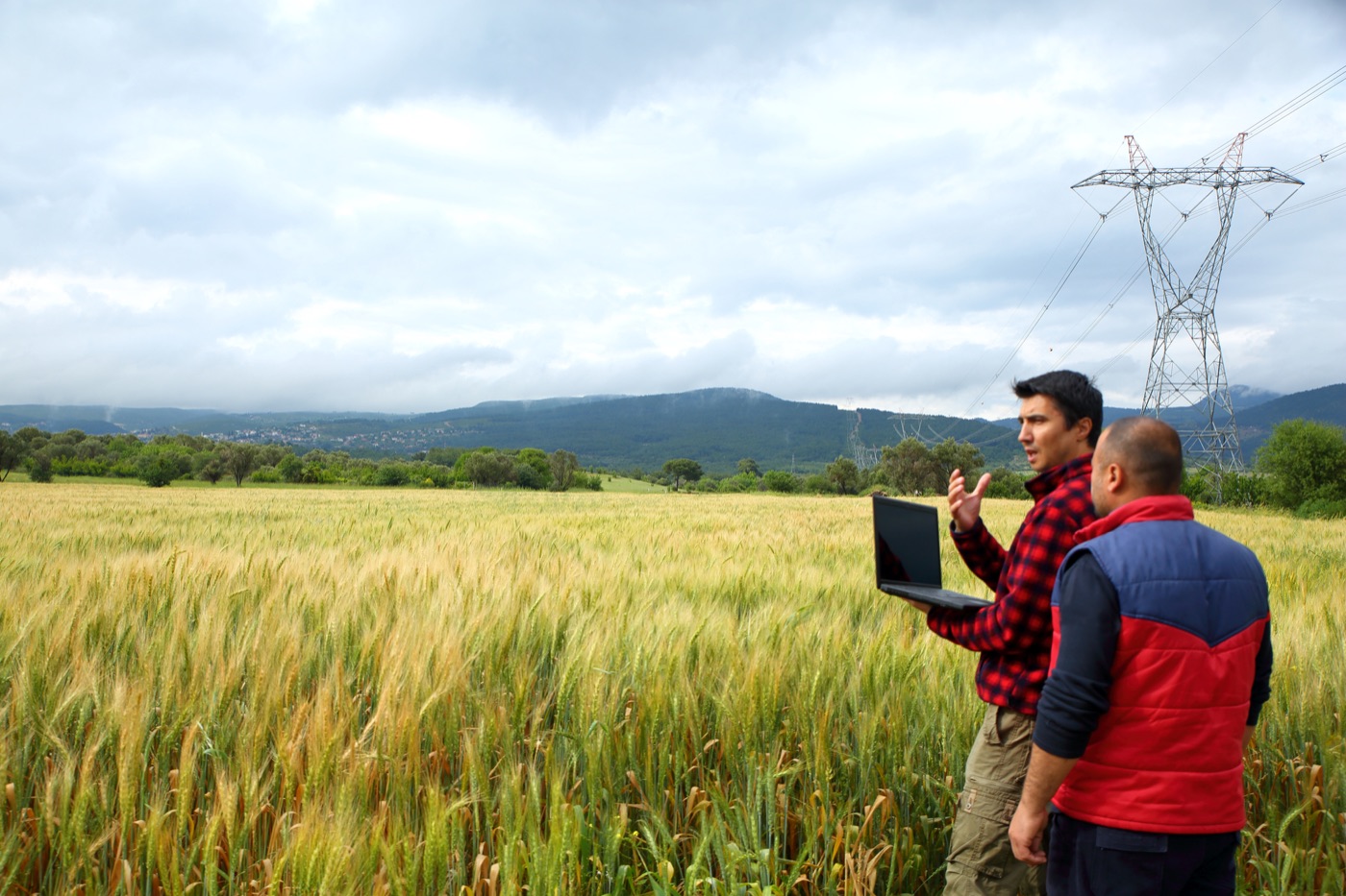
Real people, bright and natural. Office life mixed with industries Alert Enterprise serves. Brand colors in frame help.







Adding color and text to photos
management
Choosing a photo
- Real people doing real work, looking at their work rather than at a camera.
- Industry settings (energy, utilities, construction, airports, healthcare) balanced with office life.
- Badges, lanyards, turnstiles and phones are good. Any readers or locks shown should be plain or clearly made by a partner.
- Natural light, warm and saturated. No blue-tinted "cyber" stock imagery and no hooded hackers.
- No faces cropped at the eyes and no posed handshakes.
Charts
A chart answers one question. Purple carries the data, coral marks a point worth noticing, and green, amber and red mean status.
Color order
Use these in order. Past the fourth, group the rest as Other.
Green, amber and red mean granted, expiring and denied. Never use them to tell one ordinary series from another. rule: coral-is-not-danger
Which chart
Start from the question. Pick one to see it in our colors and type.
Getting it wrong, and right
Numbers and labels
- Group thousands with a comma. Write 12,482, never 12482 or 12.5k in a table.
- Round counts to whole numbers. Keep one decimal for rates, and only where it changes a decision.
- Name the unit once, in the title or the axis, and never on every bar.
- Say the period in words: last seven days, this month, since Monday.
- Give every chart a title that states the finding, not the field name. "Weekend traffic drops by three quarters" beats "Events by day".
- Put the number in a sentence wherever one number will do. A chart of one value is a waste of a chart.
Charts in reports and slides
- One chart per point. If it needs two readings, it is two charts.
- Keep labels small and gray, grid lines faint, and leave out borders and background fills.
- Label lines directly at their ends instead of a legend when there are three or fewer.
- Charts inherit the page. On a dark slide the same chart keeps its colors and flips its labels.
Voice
Plain, specific and calm. Our readers are busy security and facilities teams. Say what happened, or what a button does, in as few words as possible.
Principles
- State the fact. Name who, which door, what time. "Lobby A turnstile 2 is offline", not "An issue was detected".
- Label, don't explain. A setting says what it does. Why it exists belongs in documentation.
- No technical jargon on screen. Customers should not see engineering words such as endpoint, cache or webhook.
- No slogans in products. Headings describe; they do not sell.
- Name the manufacturer when hardware is involved. Alert Enterprise is a software company.
- Use the same status words. See Terminology below.
Before and after
Check your writing
Paste some text to flag words and phrases to avoid. It catches common problems; still read it yourself.
Style details
- Capitalize only the first word of headings and buttons. Product names keep their capitals.
- No em dashes or en dashes. Use a comma, a colon, parentheses or a second sentence.
- Use numerals (3, not three) in products. Use 24-hour time on screens (09:42) and 12-hour time in email and marketing.
- Dates: 22 Sep 2026 on screens, September 22, 2026 in writing, 2026-09-22 in file names.
- Buttons are verbs naming a result: "Revoke badge", not "OK" or "Submit".
- Errors say what happened and what to do next, in that order, without apology.
- No emoji in product, documents or email.
Terminology
Use one word for one thing. Words to avoid are marked in red.
- Identity
- A person known to our software: employee, contractor, visitor or vendor. Say "user" only for someone who signs in.
- Credential
- Anything that proves identity at a reader: a plastic card, a mobile credential, a PIN. General term.
- Badge
- A credential issued to a person, physical or in a wallet. "Employee Badge in Apple Wallet" is the product name. Avoid "pass" for employee badges.
- Access level
- A named set of doors and schedules granted to an identity.
- Access request
- A request for an access level, with a requester, an approver and a decision.
- Visitor
- A person on site for a limited time, invited by a host. Visitors get a visitor pass, not a badge.
- Host
- Employee responsible for a visitor.
- Reader
- Device at a door that reads credentials. Made by partners such as HID, Wavelynx and LEGIC. Never imply AE makes readers.
- PACS
- Physical access control system: software and hardware that run doors. Spell it out on first use.
- Issue
- Give someone a badge or credential. Prefer "Issue badge" to "Provision".
- Revoke
- End a credential permanently. Distinct from suspend, which is reversible.
- Event
- A record of something that happened: access granted, access denied, a door forced open.
- Status words
- Granted, Denied, Pending, Expiring, Expired, Active, Inactive, Suspended, Revoked, Online, Offline. Capitalized as badges, lowercase in sentences.
- Admin page
- AE Verify settings and management screen. Avoid "console".
- USB reader
- Small desktop badge reader made by rf IDEAS. Avoid "dongle".
Accessibility
Our products and materials should be easy to read and use, including people with low vision and people who use a keyboard instead of a mouse. We follow the WCAG 2.2 AA accessibility standard.
Readable color pairs
Text and background pairs used in our products, checked for readability in light and dark.
| Scheme | Pair | Use | Ratio | Needs | Result |
|---|
Requirements
- Text stands out clearly from its background. Large text can be a little lighter.
- Anything clickable shows a purple outline when reached by keyboard.
- Buttons are big enough to tap easily.
- Never rely on color alone. Status labels always include a word.
- State lives in native attributes and ARIA (
disabled,aria-pressed,aria-selected,aria-invalid,aria-busy). - Movement can be turned down, and nothing flashes.
Downloads
Seven downloads: logos, Aeonik, icons, photography, gradients, wallet buttons and code.
Use these files as they are. Never redraw, retype, recolor or restretch anything in them. rule: logo-no-edit
Single files are listed inside each download.
Using AI tools
AI assistants such as Claude or ChatGPT can follow these guidelines and produce work that already looks like Alert Enterprise.
Three ways to use them
Give your assistant the address of this page and ask for what you need. It reads the rules itself.
For assistants that cannot open links. One copy, then ask for a document, slide or page.
Colors, spacing, rules and assets are published in formats software can read.
Ask for what you want
Examples that work.
Click any example to copy it.
What an assistant knows
Once it has these guidelines, it will follow them without being told each time.
- Our colors, type, spacing, shapes, shadows and gradients, with the exact values.
- The rules, including which ones are firm and which are preferences.
- Which color pairs are readable, already measured.
- Where to find our logo, icons, fonts and photographs, and which file to use.
- How we write, and the words we avoid.
Updates
These guidelines are updated over time. Changes are listed below with a date.
Who to ask
- Matt Bennett owns these guidelines. Send questions and suggestions to him.
- Values change in
tokens/src/tokens.mjs, thennode tokens/build.mjsandnode scripts/build-agents.mjs. A change that fails a contrast check does not ship. Versions: a renamed or removed value is a major version, an addition is a minor, a small adjustment is a patch.
Open items
- ProductsAdd a complete list of product names.
- PhotographyConfirm web and partner rights for our photos.
- HostingDecide where these guidelines are published and who can see them.
What changed
- 0.2.022 Sep 2026. New modern look: frosted glass, soft gradients, larger headlines and product screens in app windows. Plain-language rewrite.
- 0.1.122 Sep 2026. Company name set as two words. Aeonik downloads and installers added.
- 0.1.022 Sep 2026. First version.